App Icon Design Guide 2026: Best AI Prompts for Flat, Isometric & Glassmorphism Icons
Your icon looked great in Figma. It had crisp edges, a nice gradient, and a soft shadow underneath. Then you shipped it.
On the iPhone home screen, it turned into a muddy blob because the system added its own material on top of what you designed. On a Pixel running Android 16, the launcher removed your brand blue and repainted the whole icon in a wallpaper tint. App Store Connect rejected your upload completely because your 1024 master had an alpha channel it won't accept.
None of this is a design failure. It is a spec failure, and 2026 is the year the specs changed.
Apple rebuilt app icons using layered, reflective Liquid Glass artwork created in Icon Composer. Google went in the opposite direction, making themed monochrome icons a requirement. Android now generates one automatically, whether you provide the layer or not. These two major platforms are pulling your artwork in different directions at the same time.
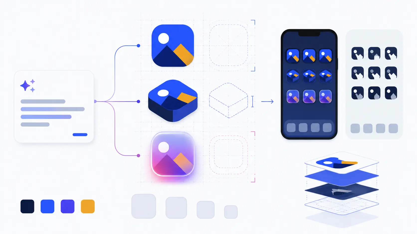
SVGMaker approaches this as a complete AI app icon workflow instead of just a one-click image generator. It helps designers and product teams create original icon concepts, explore different styles, and refine individual elements while keeping the core artwork editable and scalable. Instead of regenerating the entire icon each time, you can adjust the symbol, colors, background, spacing, gradients, shadows, and visual weight until the design fits your brand.
This guide explains what changed, the numbers you need before using any tool, and a prompt system for generating flat, isometric, and glassmorphism icons that work on both platforms. Every prompt here is ready to use. Every spec is the current one.
Why App Icon Design Changed in 2026
For roughly a decade an app icon was one flat square. You drew it at 1024x1024, exported a stack of resized PNGs, and that was the job. Both platforms broke that model in the same eighteen months.
On Apple's side, iOS 26, iPadOS 26, macOS Tahoe 26, and watchOS 26 render icons through a live material called Liquid Glass. Your icon is no longer a picture. It is a stack of layers, an opaque background plus foreground groups ordered back to front, saved as a single .icon document from Icon Composer. The system then renders it across six appearances: default, dark, clear light, clear dark, tinted light, and tinted dark.
The consequence for anyone generating artwork is blunt. You must supply flat, opaque, controllable layers. Apple applies the glass material, the specular highlights, the inter layer shadows, the bevel, and the corner mask. If you bake any of those into your source art, they get applied twice and the icon looks wrong in exactly the way that is hardest to debug.
On Google's side, the pressure runs the opposite way. Adaptive icons already required separate foreground and background layers. Android 13 added an optional monochrome layer for themed icons. Then Android 16 and its QPR2 update started deriving a themed icon automatically by color filtering your launcher icon when no monochrome layer exists, and apps cannot opt out.
Read that again, because it is the practical headline of the year. If you do not draw a monochrome silhouette, Android will make one for you, and the automatic conversion tends to fill holes and merge shapes that were meant to stay separate. Your only real choice is whether the themed version is designed or accidental.
The Platform Specs You Actually Need
Before any prompt, any tool, any style decision, get these numbers right. Most icon problems are one of these rules being broken.
| Platform | Master canvas | Key sizes | The rule that trips people up |
|---|---|---|---|
| iOS 26 / iPadOS 26 | 1024x1024 layered .icon | Xcode generates the rest from one master | Keep to 2 to 4 layer groups. Never bake in the glass material, blur, bevel, inter layer shadow, or corner mask |
| App Store marketing icon | 1024x1024 flattened PNG | Exactly one size | No alpha channel at all. No transparency, no rounded corners, no inset, no outer shadow. Square 90 degree corners |
| macOS Tahoe 26 | 1024x1024 layered .icon | 16, 32, 128, 256, 512 pt at 1x and 2x | Same six appearances as iOS. Mac App Store image is 512 pt at 2x |
| watchOS 26 | 1088x1088 | Circular system mask | Bigger canvas than iOS. No appearance variants. Do not draw the circle yourself, and avoid pure black backgrounds |
| Android adaptive | 108dp per layer | mdpi 48, hdpi 72, xhdpi 96, xxhdpi 144, xxxhdpi 192 | Only the centered 66x66dp is guaranteed visible. The outer 18dp per side belongs to OEM masks and motion. Keep the logo between 48 and 66dp |
| Android monochrome | 108dp single layer | One silhouette | No baked background, no shadow, no color. Draw it deliberately or Android generates a worse one for you |
| Play Store listing | 512x512 | One size | 32 bit PNG, sRGB, under 1024 KB, full square and unrounded. Play adds its own radius and shadow |
| Web and PWA | 512x512 | 16, 32, 48 favicon, 180 apple touch, 192 and 512 manifest | Maskable safe zone is a centered circle with radius 40% of width. Ship a separate maskable file, do not just flag a padded normal icon |
One clarification that saves a lot of wasted credits: a "Liquid Glass" style preset is not an iOS 26 layered icon. A generator that produces a glassy looking square has produced a picture of glass. A real iOS 26 icon has separately editable background and foreground layers assembled into Apple's .icon format. Every AI tool on the market, including ours, ends that workflow with a handoff to Icon Composer. We walk through that handoff in detail in our guide on generating AI app icons compatible with Apple Icon Composer.
The Prompt Anatomy That Works
Most prompt guides give you a one line formula: subject plus style plus color plus background. That produces one decent icon and thirty inconsistent ones.
The prompts that hold up have structure. Think of it as ten slots, each answering a question the model would otherwise answer randomly.
| Slot | What it fixes | Example |
|---|---|---|
| Deliverable | Stops the model producing a sticker sheet or a mockup | “A single mobile app icon” |
| Subject | The one metaphor | “a shield with a keyhole at its center” |
| Style descriptor | Names the properties, not just the label | “flat vector, solid color fills, no tonal shading” |
| Composition | Scale inside the canvas | “centered, occupying 70% of the canvas, 15% clear margin on all sides” |
| Shape and stroke | Consistency across a set | “uniform stroke about 4% of canvas width, roughly 40px at 1024, round caps and joins” |
| Palette | Kills color drift | “deep navy #0F172A for the shield, amber #F59E0B for the keyhole” |
| Background | The single most common failure point | “solid #F8FAFC background, square corners” |
| Material and lighting | Only when the style needs it | “soft top left key light, one ambient occlusion contact shadow” |
| Negative constraints | Removes the usual junk | “no text, no letters, no watermark, no drop shadow” |
| Technical output | Reinforces your actual settings | “1:1 aspect, 1024x1024” |
The single highest leverage habit here is in the style slot. Name the properties of a style, not just its name. Writing "isometric" alone gets you an ordinary three quarter perspective drawing roughly half the time, because the model has seen thousands of images tagged isometric that are not. Writing "true isometric projection, 30 degree axonometric axes, parallel projection, no vanishing point" gets you isometric.
Here is one master prompt with every slot filled:
That is long, and it should be. You write it once, then change only the subject line for every other icon in the set.
Prompts for Flat Icons
Flat in 2026 is not the flat of 2015. The current default is often called flat 2.0: solid fills and generous negative space, plus just enough elevation to restore affordance. A slight two stop gradient, a little overlap, one restrained shadow. Not a return to skeuomorphism, just a repair of flat design's original discoverability problem.
For interface icons the working recipe is a one or two color glyph, a 1.5px to 2px stroke at 24x24, and rounded joins and caps.
Words that reliably backfire in flat prompts: 3D, render, cinematic lighting, glossy, beveled, 8K, hyper detailed. Any one of them can flip the model out of vector territory and into a product photograph.
In the AI icon generator, this maps to the Flat style preset with Minimal or Standard complexity, and Duotone or Monochrome color scheme for interface work.
Prompts for Isometric Icons
Isometric earns its place when an icon needs to explain a system rather than label a button. Infrastructure, data flows, onboarding illustrations, feature cards. It gives you most of 3D's explanatory power at SVG friendly file size.
The technical definition matters because the model needs it: 30 degree axonometric projection, the three axes 120 degrees apart, parallel projection with no vanishing point, and equal scale on all three axes. Shade with three flat values, lightest on the top face, mid tone on the left, darkest on the right.
One honest limitation: isometric icons stop being readable below roughly 48px. The face shading collapses and the silhouette turns to mush. Use isometric for feature illustration and marketing surfaces, and keep a flat or glyph variant for your toolbar and tab bar. That maps to the Isometric style preset with Standard or Detailed complexity.
Prompts for Glassmorphism Icons
Worth stating plainly before the prompts: glassmorphism is prompt driven in SVGMaker, not a checkbox. There is no glassmorphism style preset. You produce the look through prompt wording, supported by the Background, Effect, and Texture controls that do exist.
The single biggest glassmorphism failure is asking for a transparent background. Glass is defined by what you see through it. Give the model nothing behind the glass and you get a faint grey rectangle. Glass needs a colored or gradient backdrop to refract.
Two other words to avoid: crystal, which pulls toward faceted gemstones, and chrome, which pulls toward polished metal.
Two practical notes. First, in the icon generator the Background control set to gradient, plus a glow or drop shadow effect, plus a light noise or grain texture gets you most of the way to a convincing glass surface without fighting the prompt. Second, and this is the tradeoff: heavy blur and refraction do not survive a clean vector trace. Glassmorphism is almost always the case where you want raster output rather than the vector path. Save vector output for flat, outline, and glyph work where the shapes are genuinely closed.
Trigger Words vs Backfire Words
Keep this table next to you while you write prompts. It is the difference between five attempts and one.
| Style | What to say | What backfires |
|---|---|---|
| Flat | flat geometric vector icon, solid color fills, clean closed shapes, no tonal shading | 3D, render, cinematic lighting, glossy, beveled, 8K, hyper detailed |
| Isometric | true isometric projection, 30 degree axonometric axes, parallel projection, no vanishing point, equal scale on all three axes | isometric on its own, perspective view, wide angle, depth of field |
| Glassmorphism | translucent frosted glass, background visible through the glass, thin luminous rim, subtle refraction, layered transparency | transparent background, crystal, chrome, neon, lens flare, bloom |
| Line | minimal monoline icon, uniform stroke width, round caps and joins, no fill | line art (gives sketching and hatching), single line drawing, thin delicate lines |
| Glyph | solid silhouette glyph, single filled shape, minimal interior detail, bold and iconic | outline, detailed, intricate, realistic |
One more trap worth knowing. In weaker models, writing NO TEXT inside the positive prompt can actually summon those letters into the image, because the model reads the word "text" as a concept to include. Put text exclusions in a dedicated negative field where your tool has one, or phrase it as a full sentence rather than a shouted keyword.
Keeping a Whole Icon Set Consistent
A single good icon is easy. Thirty icons that look like siblings is the actual job, and it is where most AI icon workflows fall apart. Camera angle drifts. Stroke weight creeps. Padding wanders. Color shifts by a few percent per generation.
The fix is procedural, not artistic:
- Write a style constitution once. Take your master prompt, lock every slot except the subject, and save it. Change only the subject for every subsequent icon.
- Generate one icon per request. Never ask for a sheet of twelve and crop them. The model compromises on every one to fit them together.
- Establish a master icon first. Get one perfect, then treat its settings as the fixed baseline for the rest.
- Do not rely on seeds for set consistency. A seed stabilizes initial noise for controlled A/B comparison. It does not make different subjects look like one family, and it breaks across model versions and aspect ratios.
- Normalize afterward. Optical centers, stroke weights, and hex values almost always need a cleanup pass.
- Test at real sizes. 16, 24, 32, and 48px. Detail that reads beautifully at 1024 disappears entirely at 24.
That last cleanup pass is where an editor earns its keep. The SVG editor handles the visual side: boolean operations to combine and subtract shapes, direct path and anchor point editing, smart snapping with magnetic guides and equal spacing detection, and a live layers panel for reordering and renaming.
If you need the same set in several brand themes, our guide on batch recoloring an SVG icon set for multiple brand themes covers that pipeline.
Vector or Raster: What Your Generator Actually Outputs
Here is a claim worth being skeptical about. Almost every AI icon tool markets vector output. Almost none of them generate vectors.
Writing vector, SVG style, or Bézier curves into a diffusion model does not produce paths. It produces a raster image that looks like vector art, with soft antialiased edges, slightly wobbly curves, and no editable geometry underneath. To get real SVG you either generate directly into paths, or you generate a raster and then vectorize it.
| Approach | What you get | Best for |
|---|---|---|
| Diffusion model, prompted for “vector” | Raster PNG that resembles vector art | Concepting only. Do not ship it as SVG |
| Generate then vectorize | Real SVG paths traced from a clean raster | Flat, outline, and glyph icons with closed shapes |
| Native vector generation | Editable Bézier paths straight out | Simple flat and line work |
| Icon library | Hand drawn, already perfect SVG | Standard interface metaphors you do not need to invent |
| Manual vector authoring | Full control | Icon Composer layers and Android foreground, background, and monochrome drawables |
| Raster only, no vectorization | PNG at fixed sizes | Glassmorphism and 3D, where tracing would fail anyway |
SVGMaker's vector output mode works the second way: it generates the image, then vectorizes it to SVG. We are explicit about that because it determines what you should ask for. Flat, outline, and glyph prompts vectorize cleanly. Glass, gradient mesh, and heavy 3D do not, and forcing them through a trace produces hundreds of stacked paths and a file larger than the PNG it replaced.
For the full breakdown of tools in this category, see our ranking of the 12 best AI icon generators in 2026. And if your icons start life in Figma rather than a prompt, our comparison of the best Figma plugins for vector illustration and clean SVG export in 2026 covers which plugins give you a clean starting file.
Generating and Exporting in SVGMaker
The prompt is one step. The reason most teams still lose a day per icon set is packaging, and that is what the AI app icon generator is built around.
Start with a prompt or a library icon. Describe what you want, or browse 7,000+ open source icons from Tabler, Heroicons, and Lucide. Package icons and text based icons are free. AI generation costs 3 credits per run.
Set the style controls. Style (Flat, Outline, Glyph, Isometric, or Auto), Complexity (Minimal, Standard, Detailed), Color scheme (Monochrome, Duotone, Full Color), Shape (square, rounded, circle, squircle), Background (solid, gradient, or image), Effect (drop shadow, cast shadow, glow), a texture overlay, and padding anywhere from 0 to 50%. These are the controls that give a set its shared DNA, so lock them before you generate icon number two.
Preview across platforms. See the same icon rendered on iOS, Android, macOS, watchOS, and web before you commit, which catches the "unreadable at launcher size" problem while it is still cheap to fix.
Export the whole bundle. One ZIP with the platform specific sizes: the full iOS set from 40 through 180 plus the 1024 App Store image, Android mipmap densities from mdpi through xxxhdpi plus adaptive foreground and background layers and the 512 Play Store image, macOS from 16 through 1024, the watchOS set, and the web bundle with favicons, apple touch icon, maskable variants, and an og image. For Apple platforms there is also the Icon Composer export, which gives you layered assets ready to drop into a .icon document and wire up in Xcode.
Frequently Asked Questions
1. Can an AI tool generate a real iOS 26 Liquid Glass icon?
Not end to end, and be suspicious of any tool that claims otherwise. AI generates the artwork. A genuine iOS 26 icon is a layered .icon document that Apple's Icon Composer assembles, and Apple applies the glass material, highlights, shadows, and corner mask at render time. What a good tool gives you is flat, opaque, correctly separated layers ready for that handoff. Anything that shows you a shiny glass square has given you a picture of glass, not an icon.
2. Why does my icon look washed out or wrong on Android?
Almost certainly themed icons. Android 16 derives a monochrome themed version by color filtering your launcher icon when you have not supplied a monochrome layer, and apps cannot opt out. The automatic conversion tends to fill enclosed shapes and merge elements that were meant to read separately. Draw a deliberate monochrome silhouette instead of accepting the generated one.
3. What stroke width should I use for a 24x24 interface icon?
1.5px or 2px is the common standard. 1px looks fragile on low resolution screens, and 3px or above eats the interior detail at small sizes. Pick one number and hold it across the entire set, because inconsistent stroke weight is the single most visible sign of an AI generated icon family.
4. Why does the App Store reject my 1024 icon?
Nearly always the alpha channel. The App Store marketing icon must be flattened RGB with no transparency at all, no rounded corners, no inset, and no outer shadow. Check the exported PNG and confirm it reports no alpha channel. Keep the source corners square at 90 degrees and let Apple apply the mask.
5. Can I get a true SVG out of an AI icon generator?
Sometimes, with an important caveat. Prompting a diffusion model with the word "vector" gives you a raster that looks vector. Real SVG comes from either native vector generation or from vectorizing a clean raster afterward. SVGMaker's vector mode does the latter. It works well for flat, outline, and glyph icons with closed shapes, and poorly for glass and heavy 3D, where the trace produces hundreds of stacked paths.
6. How do I make 30 icons look like one family?
Lock a style constitution and change only the subject. Generate one icon per request rather than a sheet. Fix the model, style preset, complexity, color scheme, shape, and padding before the second icon. Then normalize optical centers, stroke weights, and hex values in an editor, and test the whole set at 16, 24, 32, and 48px side by side.
7. Do I still need a monochrome layer if I do not want themed icons?
Yes. Not supplying one is no longer a way to avoid theming, it is just a way to get a worse themed icon. Android generates the monochrome version regardless, so your only real choice is designed or automatic.
8. What canvas size should I design at?
1024x1024 for iOS, macOS, and the App Store, 1088x1088 for watchOS, and 108dp layers with a 66dp visible viewport for Android adaptive. If you are generating one master to derive everything else from, 1024x1024 with a generous centered margin is the safest starting point.
Conclusion
App icon design in 2026 comes down to three things, in order.
Know the platform rules first. Most icons fail on a spec, not on taste. The alpha channel, the 66dp viewport, the monochrome layer, the maskable safe zone. Get those right and half the usual problems never happen.
Write structured prompts, not one liners. Fill every slot: deliverable, subject, style properties, composition, stroke system, palette with hex codes, background, negatives. Name what a style is, not just what it is called. Then change only the subject line for the rest of the set.
Refine in an editor. AI gets you most of the way there and leaves the last mile: optical centers, stroke normalization, path cleanup, accessibility attributes.
You can run all three steps in one place. Generate with the SVGMaker’s app icon generator, refine in the editor, clean up the markup in the code editor, and export a platform ready bundle for iOS, Android, macOS, watchOS, and web without leaving the browser.