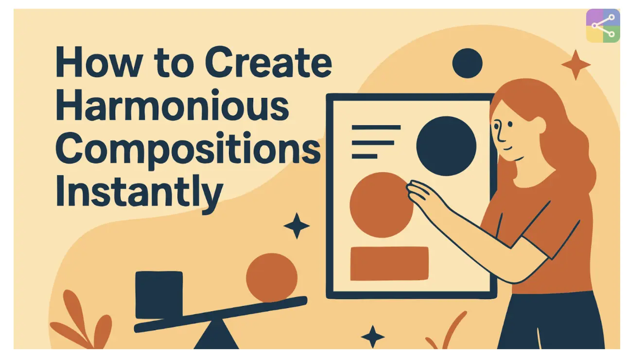
How to Create Harmonious Compositions Instantly – Master Visual Balance

Creating art that feels balanced and pleasing to the eye is not just about talent. It is about understanding how the elements in a piece interact and complement each other. Whether you are working digitally or traditionally, learning to create balanced compositions will take your designs from good to unforgettable.
Harmony in art ensures that every part of the composition feels connected and cohesive, guiding the viewer's eyes naturally through the piece. Here, we will explore practical ways to bring harmony into your work, share an example of harmony in art drawing, and show you how to instantly achieve visual balance using modern AI tools like SVGMaker.
What You'll Master:
Understanding Harmony in Art
Harmony is the arrangement of different visual elements so they work together as a whole. It is about ensuring that colors, shapes, textures, and lines feel like they belong together. Without harmony, a piece can feel disjointed and confusing. With harmony, it feels intentional and complete.
Artists achieve harmony by controlling relationships between elements such as:
Color
Selecting shades that complement each other.
Proportion
Keeping elements in scale with each other.
Repetition
Using certain patterns or shapes to unify the design.
Rhythm
Creating a flow that guides the viewer's gaze.
Harmony is not about making everything look the same. Instead, it is about making sure differences work together rather than compete for attention.
Why Harmonious Compositions Matter
When a composition lacks harmony, the viewer may not know where to focus. Their attention might jump from one unrelated element to another, creating a sense of discomfort. In contrast, harmonious compositions feel natural to look at, which allows the viewer to absorb the intended message or emotion without distraction.
This is why harmony plays a key role in branding, illustrations, and digital art. In marketing visuals, harmony builds trust and professionalism. In fine art, it evokes emotions more effectively. Even in quick sketches or casual designs, a balanced composition makes the work more appealing.
How to Create Harmonious Compositions
1. Start with a Clear Concept
Before you put anything on the canvas or screen, define the purpose of your piece. Ask yourself what emotion you want to convey and what message you want the audience to take away. A clear purpose will guide every design decision you make.
2. Choose a Color Palette Wisely
Colors have a huge influence on harmony. Limiting your palette to a few complementary colors helps ensure a cohesive look. Tools like color wheel apps or design software can help you find combinations that work well together.
3. Balance Elements Visually
Balance does not always mean symmetry. Asymmetrical balance can also be harmonious if the visual weight on both sides of the composition feels equal. This can be achieved by adjusting size, color intensity, or spacing.
4. Repeat Patterns and Motifs
Repetition brings familiarity and order to a piece. You can repeat shapes, lines, or textures in subtle ways to make your artwork feel connected.
5. Control Contrast and Variety
Variety adds interest, but too much can break harmony. Use contrast thoughtfully, whether in color, texture, or scale, so that it highlights important areas without overpowering the rest.
Creating Harmony in Digital Artwork
If you are creating art digitally, harmony is just as essential as in traditional media. The advantage is that digital tools allow you to experiment quickly with balance, color, and layout. By using layering, scaling, and color adjustments, you can instantly see how changes affect the harmony of your work.
SVG (Scalable Vector Graphics) formats are especially helpful for maintaining balance and clarity. Because SVGs can be scaled without losing quality, they allow you to arrange elements in a precise way without worrying about distortion.
Create SVG Harmonious Compositions Free
Modern tools make it easy to create harmonious compositions even if you are not a professional designer. With its simple interface, you can arrange shapes, adjust proportions, and fine-tune colors in real time. You can also import existing images and convert them into clean, scalable artwork.
If you have a PNG file you want to adapt for a balanced composition, the PNG to SVG feature can transform your image into a flexible format that is easier to refine.
The built-in SVG Converter ensures that your final design stays crisp no matter the size, making it perfect for everything from website icons to large print designs.
Quick Tips for Instant Harmony
Group Related Elements
Place similar objects close together so they read as part of the same section.
Use a Grid
Grids can help you align elements evenly and maintain balance.
Limit Fonts and Sizes
In text-based designs, using too many fonts can disrupt harmony.
Check from a Distance
Zooming out helps you see if the composition feels balanced overall.
Remove the Unnecessary
Sometimes harmony comes from simplification.
Training Your Eye for Harmony
Creating harmonious compositions becomes easier with practice. The more you observe and analyze artworks, whether in galleries, design portfolios, or nature, the better you understand how elements interact. You will start to recognize when something feels "off" and know how to adjust it.
You can also train your eye by experimenting with the same subject in different arrangements. For instance, take a single object and place it in various positions within a frame. Notice how each arrangement changes the feel of the piece.
Bringing It All Together
Harmony is one of the foundations of effective visual design. It transforms scattered elements into a unified, engaging whole. Whether you are painting, sketching, or designing digital graphics, understanding harmony will make your work more impactful.
By focusing on balance, repetition, proportion, and controlled variety, you can create artwork that feels intentional and satisfying. Modern design tools like SVGMaker add even more possibilities, allowing you to create harmonious compositions instantly.
Frequently Asked Questions
1. What does it mean to create harmonious compositions in art?
Creating harmonious compositions in art means arranging elements such as shapes, colors, lines, and textures in a way that feels balanced and visually pleasing to the viewer. It involves ensuring no single part of the design overwhelms the rest.
2. How can beginners start creating harmonious compositions?
Beginners can start by focusing on the rule of thirds, using consistent color schemes, and paying attention to spacing and proportion. Practicing with simple designs and gradually incorporating more elements can help develop this skill.
3. What are the key principles of visual harmony?
The main principles include balance, proportion, alignment, repetition, contrast, and unity. Together, these elements help ensure that the overall composition feels cohesive and engaging.
4. Can digital tools help in creating harmonious compositions?
Yes, digital design tools can help artists and designers experiment with layouts, color schemes, and proportions quickly, making it easier to identify and achieve harmony in a composition.
5. What is an example of harmony in art drawing?
An example of harmony in art drawing could be a landscape where the colors, shapes, and textures work together to create a peaceful and balanced scene without any element appearing out of place.
6. How important is color in achieving harmony?
Color plays a crucial role in creating harmony. Choosing colors that complement each other, follow a color scheme, or match the intended mood of the piece can significantly improve visual balance.
7. What is the difference between harmony and unity in art?
While both are related, harmony focuses on how individual elements work together, whereas unity is about the overall sense of completeness in the composition. Harmony often contributes to achieving unity.
8. How can spacing and alignment affect composition harmony?
Proper spacing and alignment ensure that the viewer's eye moves naturally across the artwork. Even spacing and thoughtful alignment prevent the design from feeling cluttered or awkward.
9. Is it possible to create harmonious compositions for both digital and traditional art?
Yes, the same principles of harmony apply to both mediums. Whether working on a canvas or a digital screen, artists can use balance, proportion, and color theory to create cohesive designs.
10. How can I improve my skills in creating harmonious compositions over time?
Regular practice, studying professional artworks, experimenting with different styles, and seeking feedback from others can help improve composition skills and deepen understanding of visual harmony.
Start Creating Harmonious Compositions Today
With practice and the right approach, harmony becomes second nature. Your audience will not just see your work, they will experience it as something whole and complete.
If you want to explore how effortless harmony can be in your own designs, try SVGMaker today. From turning PNG to SVG to refining every element with precision, it is your all-in-one tool for beautiful, balanced creations.
