Why Many Online Images Break on Responsive Websites And How SVGs Solve It
Have you ever opened a website on your phone and noticed that an image looks blurry or stretched? Maybe a logo that looked perfect on a laptop suddenly appears fuzzy. Or a button icon shifts out of place when the screen gets smaller. These problems are more common than you think. They happen because many images are not built for responsive screens.
Websites today need to adjust to countless screen sizes. Phones, tablets, laptops, desktop monitors and even smart TVs all show content differently. When images do not adapt well, the layout breaks. The user experience suffers. The good news is that there is a simple solution. SVG graphics can fix most of these issues with no extra effort.
In this blog, we explore why online images break so easily and how switching to SVG can make your website look clean and sharp on every device.
Why Do Images Break on Responsive Websites
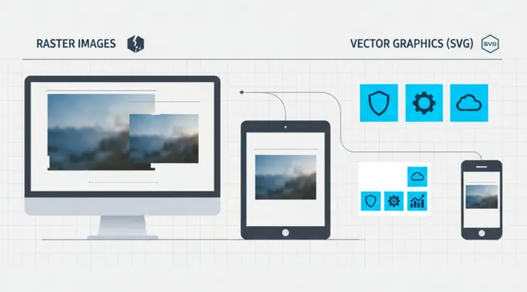
Most images on the internet come in raster formats like JPG or PNG. These formats are made of fixed pixels. This means they only look perfect at the size they were originally created. Once you stretch them beyond that limit, the pixels enlarge and the image loses clarity.
Here are the most common issues:
1. Blurriness
When a raster image scales up, the pixels stretch. This causes the edges to become soft and unclear. A logo that looks sharp on a desktop may look fuzzy on a mobile screen.
2. Cropping or Misalignment
Responsive layouts change proportions. A raster image may not fit these changes smoothly. Parts of the image may get cut off or shift in unexpected ways.
3. Slow Loading
High resolution raster images can be heavy. When they load slowly, the entire page slows down. This hurts user experience and search performance.
4. Poor Display on High Density Screens
Modern screens have very high pixel density. If a raster image is not high resolution, it appears faded or pixelated.
To summarize these issues:
| Problem | What You See | Why It Happens |
|---|---|---|
| Blurry images | Soft or unclear visuals | Pixels stretch when scaled |
| Cropped images | Parts cut off | Fixed dimensions do not fit changing layouts |
| Slow loading | Delays on mobile or slow networks | Image file is too large |
| Pixelation on retina screens | Grainy or rough display | Low resolution image cannot match screen density |
These issues show why raster images struggle with responsive design.
Why Raster Images Are Limited for Responsive Websites
Responsive design means layouts must adjust fluidly. But raster images do not adjust well because they are built with fixed pixel information. If the design grows beyond the image size, the image cannot fill the space without losing sharpness. If the design shrinks, the image might compress awkwardly.
Downscaling usually hides flaws. Upscaling exposes them. This is why your website logo may look perfect on a large monitor but lose quality on a small phone.
Raster images also cannot adapt to different aspect ratios. A square image might get squeezed into a rectangle container and vice versa. The result is distortion.
How SVGs Solve Responsive Image Problems
SVG stands for Scalable Vector Graphics. Unlike raster images, SVGs are not made of pixels. They are made of paths and shapes. This allows them to scale smoothly without losing image quality.
Here is what makes SVGs perfect for responsive design:
They stay sharp at any size
Because SVGs rely on mathematical shapes, they never blur. Whether shown on a tiny phone or a huge monitor, the result is always crisp.
They load fast
SVG files for simple graphics are usually small. This improves website performance and loading speed.
They are easy to style
You can change colors, sizes, or even animation using simple code. No need to edit the original file.
They look perfect on retina and high resolution screens
Since SVGs are not tied to pixels, they always match the screen density.
They adapt smoothly to responsive layouts
No stretching, no distortion, no messy alignment issues.
Here is a simple comparison:
| Feature | Raster Images | SVG |
|---|---|---|
| Scalability | Loses quality when resized | Always sharp |
| File size | Larger for high resolution | Usually small |
| Retina display support | Needs large file to look good | Perfect at any size |
| Best use cases | Photos | Icons, logos, illustrations |
| Easy editing | Limited | Very flexible |
This is why many designers and developers now prefer SVG for modern responsive sites.
Where SVGs Improve Responsive Design the Most
SVGs shine in several areas of web design. They work especially well in:
Logos
A logo must look sharp everywhere. SVG ensures brand consistency.
Icons
UI elements like arrows, buttons, symbols, and menu icons scale perfectly across screens.
Illustrations
Simple art, line drawings, and minimal illustrations stay clean without pixelation.
Patterns or decorative elements
SVGs are lightweight and ideal for background shapes or patterns.
Infographics and charts
Numbers and shapes need to be clear at any size. SVGs keep the details intact.
These graphics make up a large part of modern web design. Switching these assets to SVG can greatly reduce responsive layout issues.
When Raster Images Still Make Sense
It is important to note that SVG is not ideal for photos. Raster formats like JPG or WebP remain best for:
Photographs of people
Landscapes
Detailed textures
Realistic imagery
These images contain complex colors and details that SVG cannot recreate efficiently. For these, raster formats remain the right choice. SVG is best for simpler graphics.
How You Can Use SVGMaker for Responsive Graphics
If you already have raster graphics that break on mobile, you can convert them into SVG when suitable. Logos, icons, shapes, and illustrations convert very well. Once converted, you get a file that scales smoothly across all screen sizes.
With our converter, you can upload an image and get a clean SVG version quickly. This is especially helpful when preparing graphics for responsive websites, modern apps, or digital interfaces.
SVGMaker helps you:
Convert graphics into scalable SVG
Create responsive friendly assets
Keep your design consistent across screens
Reduce issues like blurring and distortion
This gives you more control and cleaner results without extra design software.
Frequently Asked Questions
1. Why do images look blurry on some devices but not others?
Blurriness happens when a raster image is stretched beyond its original size. Since JPG and PNG files are made of fixed pixels, they lose clarity when resized. When screens have higher resolution, the image cannot match the density and appears soft.
2. Why do images sometimes get cut off on mobile screens?
Responsive layouts change shape as screen sizes change. If an image has fixed dimensions, it may not fit the new layout. This causes parts of the image to be cropped or misaligned.
3. What makes SVG different from JPG or PNG?
SVG graphics are made of paths and shapes instead of pixels. This means they scale smoothly at any size. A single SVG works across all screens and stays sharp even on high resolution displays.
4. Does using SVG make a website load faster?
For simple graphics like icons or logos, SVG files are often much smaller. This can improve loading speed and reduce the weight of your page. Faster pages help both user experience and search performance.
5. Should every image on a website be an SVG?
No. SVGs are great for logos, icons, illustrations, and interface graphics. Photos still work best as JPG, PNG, or WebP files. Use SVG for graphics that need clean lines and perfect scaling.
6. Why do raster images break on responsive sites?
Raster images have fixed pixel data. When they are resized or forced into changing container shapes, they stretch or distort. This leads to blurry edges, misalignment, or unusual cropping.
7. Can SVGs be used on all modern browsers?
Yes. Most modern browsers fully support SVG files. They display correctly, load fast, and work well across different devices.
8. What happens if I convert a photo into an SVG?
Photos do not convert well into SVG because they contain too many complex details. The result may look more like a simplified illustration. Use SVG for graphics and keep photos in raster format.
9. Do SVG files stay sharp on retina screens?
Yes. SVG files always stay sharp because they are vector based. They scale to match the density of any screen, including retina and 4K displays.
10. Can SVGs reduce layout issues in responsive design?
Yes. Because they scale smoothly, SVGs help maintain consistent alignment and appearance. They adjust automatically to container size and do not distort, making responsive layouts more reliable.
Conclusion
Many online images break on responsive websites simply because raster files are not built to scale. They become blurry, distorted, or slow down the page. SVG graphics solve these problems by staying sharp at every size and adapting beautifully to all screen types.
If you want to create responsive graphics that load fast and always look clean, try converting your assets with SVGMaker. We make it simple for you to generate scalable images that work smoothly across every device.