How to Generate a Consistent Icon Set with AI
Quick Summary
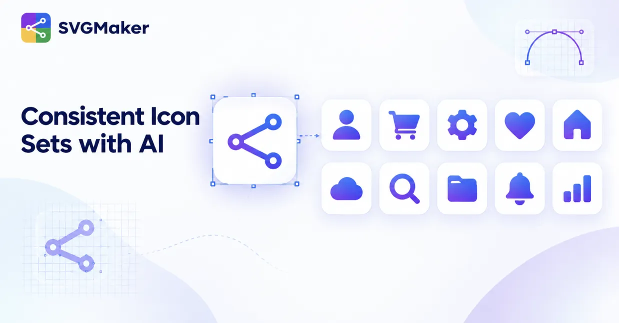
- The core problem: Each AI generation is somewhat independent. Even similar prompts produce icons with different line weights, colors, or detail levels, so a set generated one icon at a time often doesn't look like a set at all.
- The most effective fix: Generate your first icon, then use it as a reference image for every subsequent icon rather than relying on text prompts alone. An image reference locks in visual style far more reliably than repeating a text description, since the AI is matching an actual example instead of reinterpreting words.
- The backup method: If you're not using a reference image, manually lock and repeat the exact same style settings (color mode, complexity, shape, background) for every icon in the set, written down, not from memory.
- The safety net: Run the finished set through a batch color pass to catch any drift that slipped through either method.
The Fix: SVGMaker's AI Icon Generator lets you upload a reference image alongside your prompt, forming the foundation of the method outlined below.
Why AI-Generated Icon Sets Often Look Mismatched
Each AI generation is, by design, somewhat independent. Even with the same general prompt, small wording differences, or simply the natural variability of the model, can produce icons with different line weights, corner styles, or color saturation. Generate ten icons for a dashboard one at a time with slightly different prompts, and you'll often end up with ten icons that technically match your topic but don't look like they belong to the same set.
This isn't a flaw specific to any one tool. It's a natural consequence of how generative models work: each output is a new probabilistic result, not a deterministic continuation of the last one.
The Method: Lock Settings Before You Start
Step 1: Generate Your First Icon and Treat It as the Style Reference
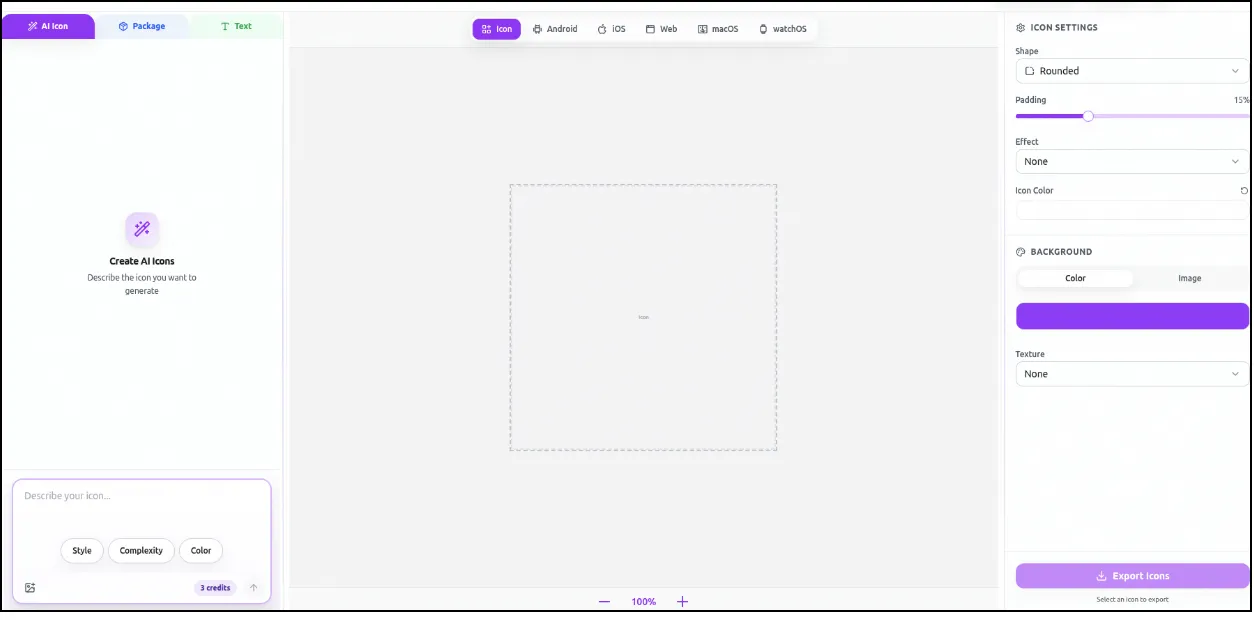
Open the AI Icon Generator and generate your first icon. Before moving on, actually look at what makes it work: the line weight, whether it's filled or outlined, the color count, and the level of detail. This first icon becomes the style anchor for everything that follows.
Step 2: Write Down the Exact Settings You Used
This step gets skipped constantly, and it's the single biggest cause of mismatched sets. Note the specific style parameters (color mode, complexity level, background setting) you used for icon one, in writing, not from memory. You'll need to repeat them precisely, not approximately, for every subsequent icon.
Step 3: Generate Each Additional Icon with Identical Settings
Go through your full icon list, generating each one with the exact settings recorded in Step 2. Only the subject of the prompt should change between icons ("shopping cart" becomes "settings gear" becomes "user profile"), while every style parameter stays fixed. Treat the style settings as locked, not as a starting point to tweak per icon.
Step 4: Review the Full Set Together, Not One at a Time
Individual icons can each look fine in isolation and still not work as a set. Lay all of them out together before finalizing anything. This is when subtle drift, a slightly heavier line weight on one icon, a marginally different shade of the same color, actually becomes visible.
Step 5: Run a Batch Recolor Pass as a Final Consistency Check
Even with locked settings, small color variations sometimes slip through, especially across a larger set. Rather than manually adjusting each icon individually, use the SVG color editor to auto-detect and standardize colors across the full set in one pass. This step catches what careful prompting alone sometimes misses, and it's much faster than fixing icons one by one.
Consistency Checklist
| Element | What to Lock | Common Mistake |
|---|---|---|
| Line weight | Same stroke thickness across every icon | Adjusting "just this one" for a busier icon |
| Color mode | Same palette or color count for the whole set | Letting the AI pick colors freely per icon |
| Fill style | Consistent choice: outline, solid, or two-tone | Mixing filled and outlined icons in one set |
| Complexity | Same detail level setting every time | Simplifying only the icons that felt "too busy" |
| Background | Consistent background setting (usually none) | Some icons generating with an unwanted background |
| Corner style | Same radius treatment (sharp vs. rounded) | Rounded corners on some icons, sharp on others |
Did you know? According to Lucidpress's State of Brand Consistency Report, based on a survey of over 200 organizations, companies that present their branding consistently saw revenue increases of up to 33%. An icon set is a small piece of that larger picture, but it's exactly the kind of detail that quietly undermines a polished brand when it's inconsistent, and reinforces one when it isn't.
What to Do When One Icon Just Won't Match
Sometimes a specific icon concept doesn't generate well with your locked settings, no matter how many times you try. When this happens, don't loosen your style settings to accommodate it. Instead, regenerate that single icon using the exact same settings a few more times, since AI generation has enough natural variability that a second or third attempt with identical parameters often succeeds where the first didn't. If it still doesn't work after several tries, manually adjusting the outlier in an editor to match the rest of the set is faster and more reliable than compromising your consistency for the whole set.
Frequently Asked Questions
1. Why do my AI-generated icons look inconsistent even when I use similar prompts?
"Similar" prompts aren't identical prompts. Small wording differences, plus the natural variability built into generative models, produce different results even from closely related descriptions. Reusing exact style settings, not just similar language, is what actually produces consistency.
2. How many icons can I generate before consistency becomes hard to maintain?
There's no strict limit, but larger sets are more prone to visible drift simply because there are more chances for a small variation to slip in. Reviewing the full set together, not icon by icon, becomes more important as the set grows.
3. Should I generate all my icons in one session?
It's not required, but it does reduce the risk of forgetting your exact settings between sessions. If you do split the work across sessions, keep your written settings reference handy rather than relying on memory.
4. Can I fix an inconsistent set after the fact, or do I need to start over?
In most cases you can fix it after the fact. A batch color pass resolves color drift specifically, and a manual touch-up in an editor can address a single outlier icon without regenerating the entire set.
5. Does locking settings limit creative variety across the set?
It limits variety in style (line weight, color, complexity), which is the point, but leaves full creative freedom in subject matter. A consistent set still needs each icon to represent something different; only the visual treatment stays fixed.
6. What's the most common mistake people make with AI icon sets?
Adjusting settings mid-set to make a specific icon "look better" in isolation, without realizing that choice breaks consistency with the rest of the set. Every icon should be evaluated against the set, not on its own.
7. Is a batch recolor pass necessary if I followed the settings exactly?
It's a safety net, not a requirement. Even careful, consistent settings can produce minor color variation across separate generations, so a final batch pass is a quick way to guarantee uniformity rather than assuming it.
Final Thoughts
A consistent icon set doesn't come from finding the perfect prompt. It comes from treating style as a fixed decision you make once, at the start, and then protecting it for every icon that follows. Use your first icon as the reference, keep the style settings written down and unchanged, change only the subject from one icon to the next, and judge the icons as a group rather than one by one.
Whatever still slips through is easy to catch at the end: a batch color pass fixes color drift, and a quick edit brings a single outlier back in line. Follow that order and a set of AI-generated icons can look like it was drawn by one designer. To put the method into practice, start with your first icon in the AI Icon Generator.